
Google Data Studio (Looker Studio) Tutorial
Google Data Studio (now called Looker Studio) can be confusing and overwhelming to navigate. But with a quality Google Data Studio tutorial, you’ll spend less time pulling reports and more time providing insights.
In this article, you’ll learn how to use Looker Studio to create and customize engaging dashboards with your data.
What Is Looker Studio (Formerly Known as Google Data Studio)?
In 2022, Google replaced its popular Google Data Studio brand with Looker Studio. It’s a free-to-use data visualization tool that lets you create performance reports easily.
It allows you to sync your data and turn information into visual dashboards that you can customize to make data-driven decisions.
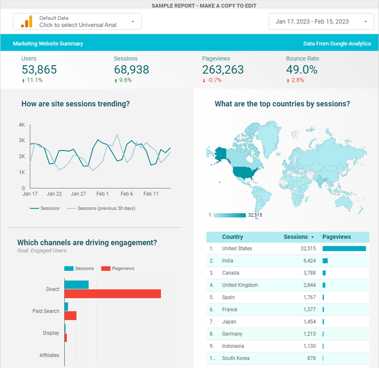
Looker Studio takes the raw data from your website, marketing, ecommerce, or other analytics tools and makes sense of it.
With charts, graphs, and tables, you can tell the stories behind the numbers.
A line chart showing how website traffic increased over time, for example, communicates information more clearly than numbers in a spreadsheet.
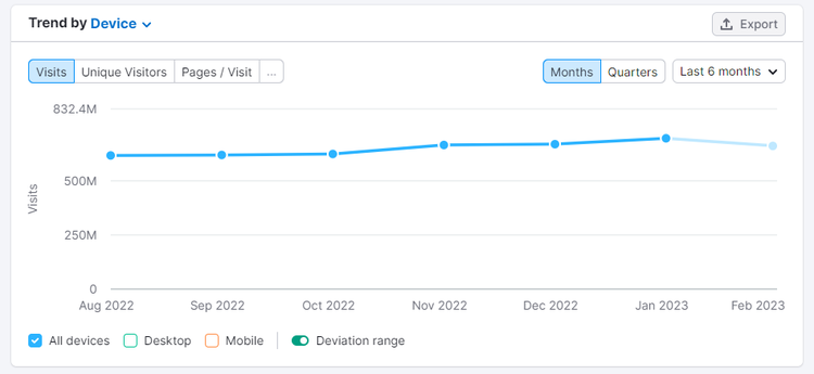
Visualizing data also makes it easier to answer questions about business goals. For example:
- What are the top traffic sources to our website?
- What are our best-selling products?
- What are our top-ranking keywords?
- Which pages have the highest bounce rate?
- Does the website attract our target demographics?
With this information, teams can make data-driven decisions.
You can use Looker Studio to visualize data:
- Internally, to help stakeholders and team members understand your industry, marketing progress, and financials
- Externally, to show research or performance insights to clients
Looker Studio is a big time saver, too. Say goodbye to data exports and spreadsheets—everything you need to analyze and present your data is in this one-stop-shop platform.
How to Sign Up for Looker Studio
If you know how to use Google Data Studio, the process to sign up for Looker Studio is similar.
The good news: Looker Studio is free for everyone. But with a new name and face, Google has also introduced a paid version, Looker Studio Pro.
Looker Studio Pro adds enterprise-level capabilities and technical support for large teams with multiple users, including:
- Team workspaces with specific permissions depending on the user’s role (e.g., Manager, Content Manager, or Contributor)
- Google Cloud project linking where data sources belong to the organization rather than individual users. That protects data—even if the creator leaves the company
But unless you need these additional features, the free version offers everything you need to create engaging reports.
Here’s how to sign up:
Step 1. Go to Looker Studio and Sign in with Your Google Account
To get started, visit the Looker Studio homepage and log in using your Google account.
Use the same account that you use for Google Analytics and other G-Suite tools to ensure everything in your Google account stays connected.
If you don’t already have a Google Account, or you don’t want to use Looker Studio with a personal account, you can create a new account for free.
Step 2. Complete Looker Studio’s Sign-Up Information
As a new user, you’ll need to enter your location, company name, and email preferences.
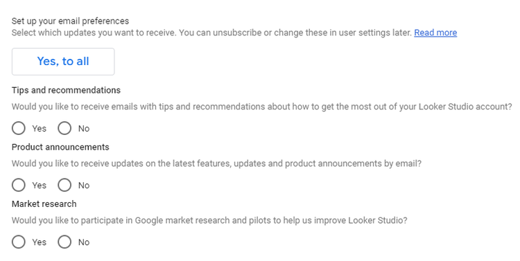
Looker Studio will then ask you to choose a connector. These are the data sources you’ll use to build reports. Let’s take a closer look.
How to Connect Your Data with Looker Studio
Looker Studio lets you connect to more than 800 data sources to sync your data in the platform.
Currently, Google offers 21 connectors for its products, including Google Analytics, Google Sheets, Google Ads, and BigQuery.
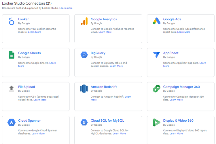
There are also more than 700 partner connectors to sync data from other marketing tools and customer relationship management (CRM) tools, including:
- Facebook Ads
- LinkedIn Ads
- Instagram Insights
- Semrush Position Tracking, Site Auditand Analytics
- Pipedrive
- Mailchimp
- Adobe Analytics
- HubSpot
- Salesforce
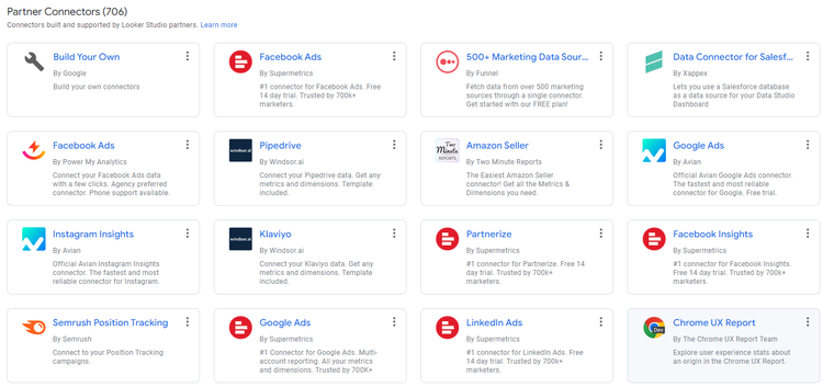
Partner connectors are apps managed by third-party providers. Most are paid tools.
You can purchase APIs for single data connectors for a monthly fee or purchase them in bundles to use across your reports. Developers set pricing.
Click on a partner connector and select “Learn More” to visit the provider’s website and view its costs.
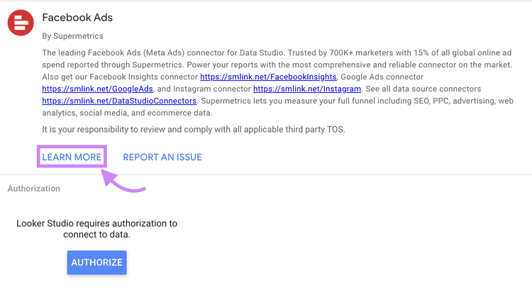
Semrush users with a Guru or Business subscription can access to our Looker Studio connectors.
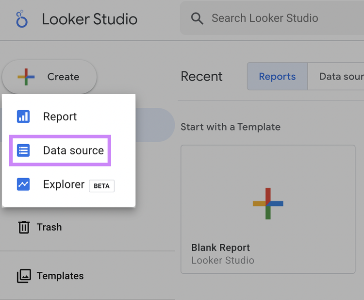
As a new user, Looker Studio asks you to add a connector before getting started. You can add more connectors at any time by clicking “Create,” then “Data source” from your homepage.
Any new data source will have the default name: “Untitled Data Source.” Change this to a title related to your data (e.g. “Google Analytics: semrush.com”). That will prevent confusion down the line and make it easier to find the right data for your reports.
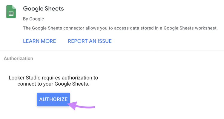
When you select a data source, authorize the connection. You need to grant access only once.
Once that’s done, you’ll notice a list of available fields you can use to create charts for your reports. Google separates these into two categories:
- Dimensions (green)
- Metrics (blue)
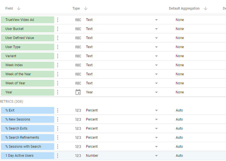
Dimensions are attributes of data. They describe or categorize your data—for example:
- Country
- Age
- Product ID
- Date
- Campaign Name
Google uses these to group your data in a chart.
Metrics are quantitative measurements of data. These are value-based—for example:
- Number
- Percentage
- Duration
- Currency
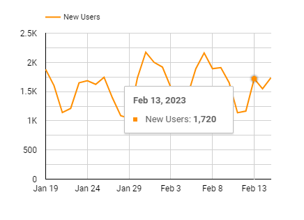
In the chart below, you can see dimensions and metrics working together:
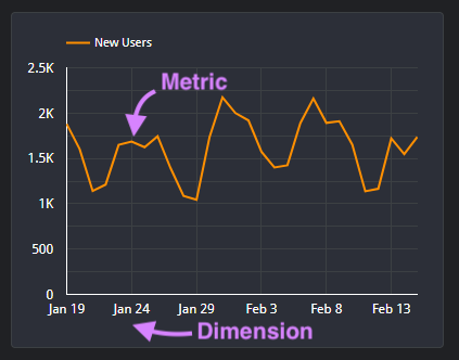
The dimension is time—in this case, the days on the horizontal (X) axis. That’s what the chart is measuring by.
The metric is new users. In this case, the number counts on the vertical (Y) axis. That’s what’s being measured.
If you need to recategorize data, click the drop-down menu in the “Type” field. Types include Numeric, Currency, and Percentage.
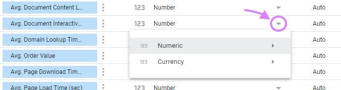
By clicking on a dimension or metric name, you can also edit what it’s called. That might be useful if you’re importing data from Excel or Google Sheets and accidentally use column headings as data labels.
With your data connected, you’ll go to your Looker Studio homepage.
A Note on Looker Studio Homepage
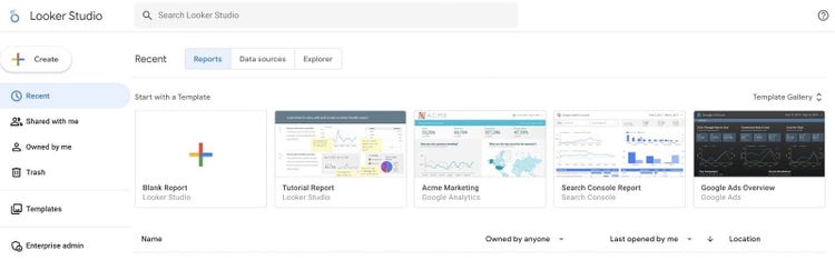
If you’re familiar with Google Analytics 4, Google Docs, or Google Sheets, you’ll be pleased to know Looker Studio shares the same simple interface:
That should make it easier to find your way around.
At the top of the homepage, you’ll see tabs for Reports, Data Sources, and Explorer.
- Reports lets you create a new report, view existing reports, or get started with a template
- Data sources are the tools you’ve connected to Looker Studio (e.g., Google Analytics, YouTube Analytics, and Google Sheets)
- Explorer is a temporary scratchpad where you can edit visualizations and filter data without affecting the live version. Files are private and temporary unless you save them.
On the left of the homepage is a menu with several options:
- Create lets you create a new Report, Data source, or Explorer
- Shared with me to view shared reports or data sources
- Owned by me to see your created reports
- Trash to view our discarded reports
- Templates to sift through the Looker Studio template gallery
If you get lost, click the Looker Studio icon to return to this page
How to Create a Report in Looker Studio
Before you get hands-on with data visualization, you need to be clear on why you’re creating a report. Think about:
- Your audience: What does the viewer want to learn from your report?
- The data you want to present: For example, pageviews, click-through rates, new visitors, or sales
Looker Studio reports are customizable. You can include metrics from multiple sources—but that doesn’t mean you should.
If you overwhelm stakeholders with irrelevant data, you run the risk of them missing important details. A report for a sales manager that includes data on best-selling products might be irrelevant to a marketing manager who wants to know which channels are top performers.
Base reports around your goals. Every stakeholder or client has different needs. Learn how they measure success so you can feature dimensions and metrics that help them make data-driven decisions.
For example, a report using Semrush's Looker Studio integration would be helpful for SEO management and reporting. Users can analyze domain analytics, track positions, and run an SEO audit, all in one place.
When you know what your report needs to get across, you can start creating.
A good place to start is with the Looker Studio Tutorial (or Data Studio Tutorial) Report. You’ll find this in the “Owned by me” menu on your homepage.
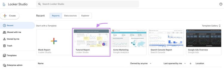
The Tutorial Report is fully interactive and walks you through how to view, edit, and create reports step-by-step.
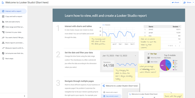
Use this to get a feel for how Looker Studio works and learn the basics. When you’re ready to move on, there are two options for building a report:
- Edit a template
- Create from scratch
Creating a Looker Studio Report from a Template
Looker Studio has a wide variety of report templates for different use cases to help you create a professional-looking report easily.
The biggest benefit of templates is that everything you need to create your report is in place. If charts fit with your goals, you can simply change the name and replace sample data with your own.
Every template is also fully customizable. You can edit data and play around with layouts and colors to create something clear and comprehensive.
Here’s how to get started:
Step 1. Find a Suitable Template
To view the Looker Studio Template Gallery, click “Templates” from your homepage menu.
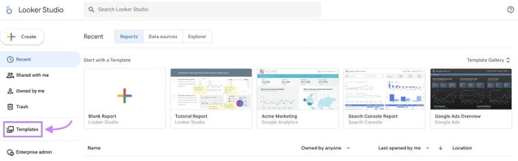
In the gallery, you’ll find templates for various Google tools:
- Google Analytics
- BigQuery
- Google Sheets
- YouTube Analytics
- Google Ads
- Search Console
- Display & Video 360
- Search Ads 360
You can filter options to find a suitable template by clicking on the “Category” drop-down menu.
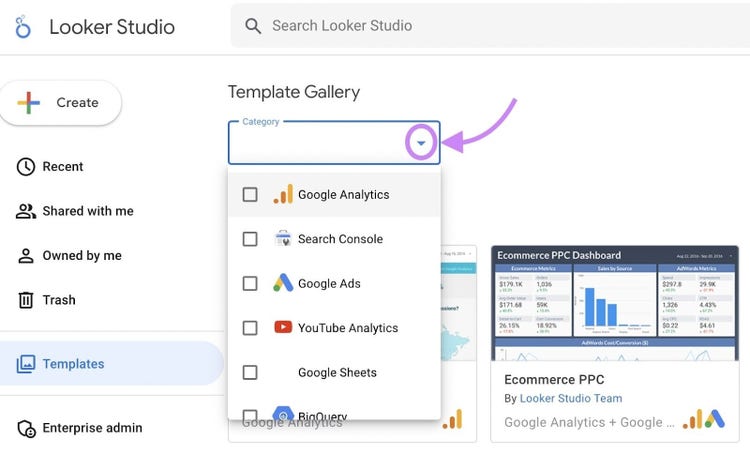
If you want a template that focuses specifically on organic traffic, check out our free SEO report template.
Step 2. Add Your Data to the Template
When you’ve found a template, you can replace Google’s sample data with your data sources. To do this, click “Use my own data.”
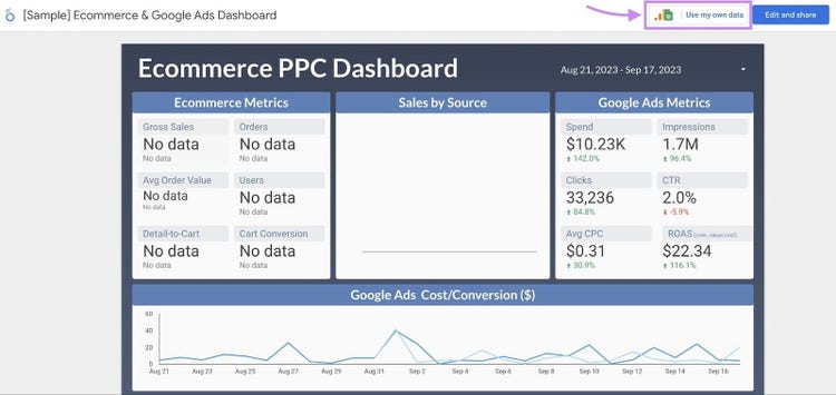
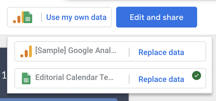
Looker Studio will ask you to authorize the data source or add a partner connector and confirm your choice.
When your data is added successfully, the “Use my data” button will display a green checkmark.
Step 3. Open the Editor and Name Your Report
If you want to tweak the template dashboard, click “Edit and share” to create a copy of the template and open the report editor
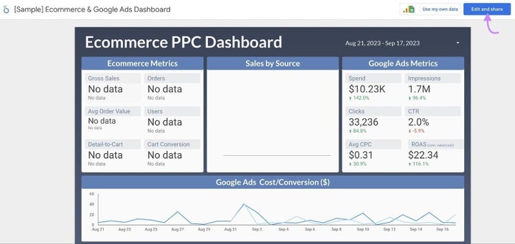
Every part of the template is now customizable. Click the name of the template in the top left of the screen to name your report. That will make it easier to find in your “Owned by me” folder.
Creating a Looker Studio Report from Scratch
Creating a new report gives you a blank canvas to design custom dashboards.
You can get started in a few clicks:
Step 1. Create a New Report
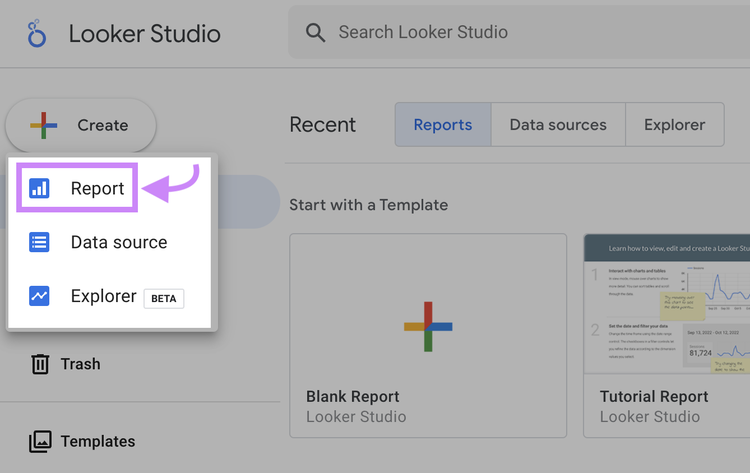
To build a fresh report, click “Create,” then “Report” from your homepage.
Step 2. Choose a Connector
Next, add a connector. That’s the data source you’ll use to build your report.
If your data source is already connected, you only need to select the data you want to use. If not, you can choose a new connector from the available options.
If you’re working on a report and want to include more data sources, you can always add connectors from within the editor by clicking “Add Data” in the Data column.
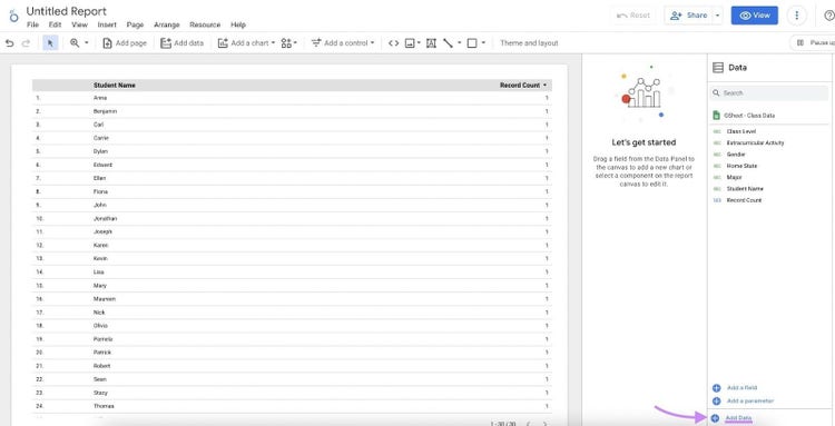
Step 3. Name Your Report
By default, new reports are named “Untitled Report.” Click on this to give your report a custom name.
Keep the name related to your data and website so it doesn’t get lost in the shuffle. For example: “Ecommerce Performance Report for MyShop.com.”
How to Edit and Customize Dashboards in Looker Studio
The Looker Studio editor is the same whether you’re editing a template or new report. The only difference is a template already has elements in place to customize. For this reason, starting with a template is a good way to get a feel for how everything works
As with the homepage, the editor interface is similar to Google Docs and Google Sheets:
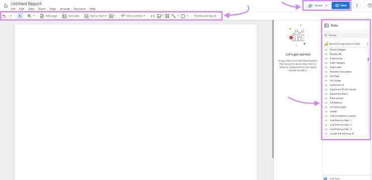
At the top of the page is the toolbar. In the top-right corner of the page are options to share and view or edit (clicking “View” in edit mode switches to view mode and vice versa).
On the right of the page is the data from your connected source. These are the dimensions and metrics that will power your charts. We’ll chat more about charts soon. First, let’s take a look at the toolbar.
The toolbar houses everything you need to build and edit a report. From here you can add:
- New pages
- Data sources (connectors)
- Images
- Text boxes
- Lines
- Shapes
- Charts
- Controls
Clicking on any of these tools and selecting a feature from the list will add it to your report automatically.
For example, if you wanted to add a text box to explain how to use a report, you can click the text icon to add it. Then, move the cursor to place it.
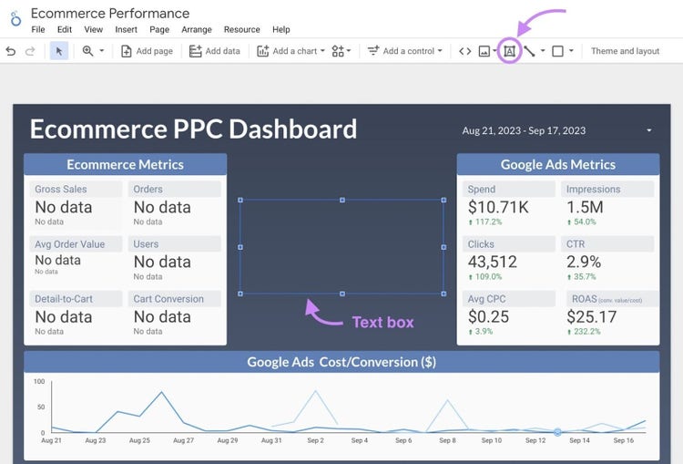
Clicking into the box lets you type. It also opens the “Text Properties” column. From here, you can format font size and type, alignment, and style options.
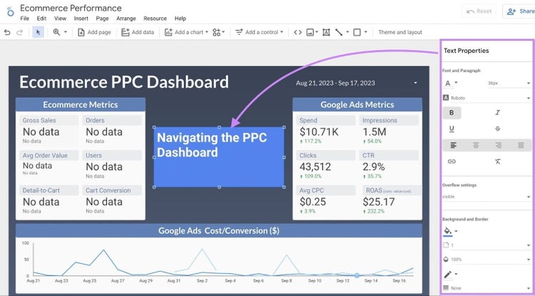
If you want to move your box, click it and drag it to a new position. If you want to resize it, click and drag any of the border squares.
Repeat this process to move, resize, or stylize any element that you add (e.g., chart, share, line).
If you want to copy, paste, duplicate, delete, or order an element, right-click on it and select your preferred option from the pop-up menu.
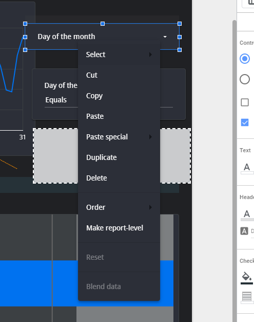
Time-saving tip: Hold shift when clicking items to select multiple charts at once. Any edits you make will apply to all sections.
From the toolbar, you can also make changes to your theme. Click “Theme and layout” to open the properties column.
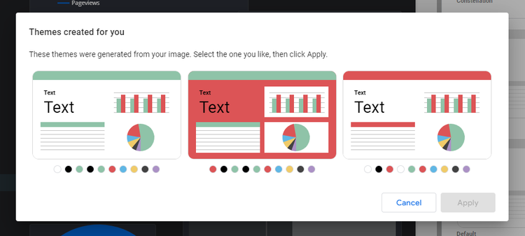
In the Theme tab, you can choose from a selection of preset themes. You can customize any of these to match your brand.

A quick way to import your brand colors is the “Extract theme from image” option. Choose an image from your computer (e.g., your brand logo or website banner) or a URL, and Looker Studio will automatically generate themes from the colors therein.
In the “Layout” tab, you can make changes to:
- Header visibility (in view mode)
- Navigation
- Report canvas size
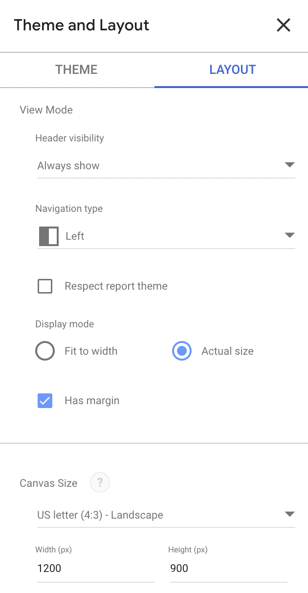
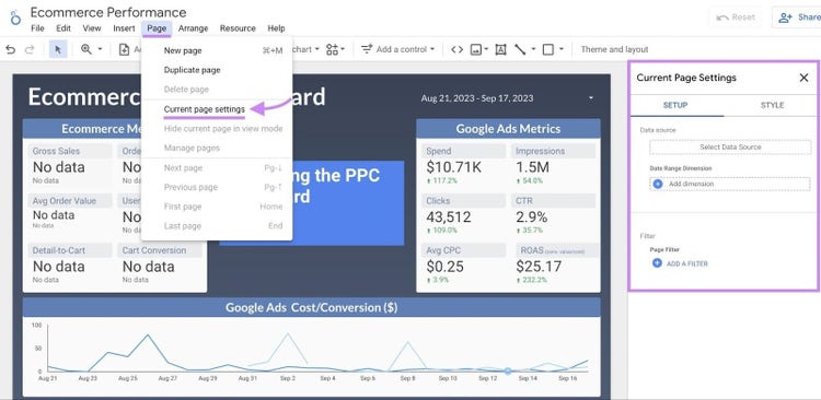
Any changes you make will apply to your theme. If your report has multiple pages and you want to change the background and size of a specific page, click “Page” then “Current page settings” in the toolbar to open style properties.
Types of Charts in Looker Studio
Once you’re familiar with the drag-and-drop editor and theme options, you can start to customize charts.
Charts are the main visual component of your Looker Studio dashboards—and how you’ll communicate the meaning behind the numbers.
There are 14 types of charts available in the editor. Each chart serves its own purpose.
It’s important to choose the right chart to show the value of your data. A viewer should be able to understand what a chart is telling them at a glance.
Here are the options and best use cases for each:
- Table: When you need to display data in rows and columns (e.g., product category, product item, and quantity sold)
- Scorecard: Display single metrics related to your report (e.g., total sales, bounce rate, ad impressions)
- Time series: Show how data changes over a period of time (e.g., website sessions over a week or quarterly profit margins for the last three years)
- Bar chart: Compare a bigger set of data, highlight categories, or show changes over time (e.g., the number of website visitors from different countries)
- Pie chart: Show relative proportions and percentages of a small dataset of up to six categories (e.g., the age demographics of your audience)
- Google Maps: Show the distribution of metrics (e.g., sessions) across the world to visualize where the audience resides and allow users to zoom in
- Geo chart: Like a Google Map, but for more general data. You can’t zoom in on a Geo chart
- Line chart: Show continuous data that changes over time or display multiple series on the same timeline (e.g., showing sales, views, or trends over time vs. the competition)
- Area chart: Like a line chart or time series chart. Use to compare data trends over time (e.g., sales of one product vs. another, or landing page comparisons)
- Scatter chart: Show the relationship between two metrics for up to three dimensions (e.g., the correlation between ad spend and conversion rate for a campaign)
- Pivot table: Pivots show data in a way that’s cleaner than standard tables. Use to display data relationships (e.g., display revenue by country or demographic)
- Bullet chart: Show how well a specific metric is performing against target benchmarks (e.g., actual vs. target sales, or actual traffic vs. target vs. previous year)
- Treemap: Use as an alternative to pie charts to show the percentage of multiple categories (e.g., average sales for different categories or top customer demographics)
- Gauge chart: Show how well a metric is performing against a target goal (e.g., actual conversions vs. target conversions)
How to Add a Chart in Looker Studio
To add a new chart, click “Add a chart” in the editor toolbar and select the one you want from the list. Looker Studio selects a dimension and metric suited to the type of chart.
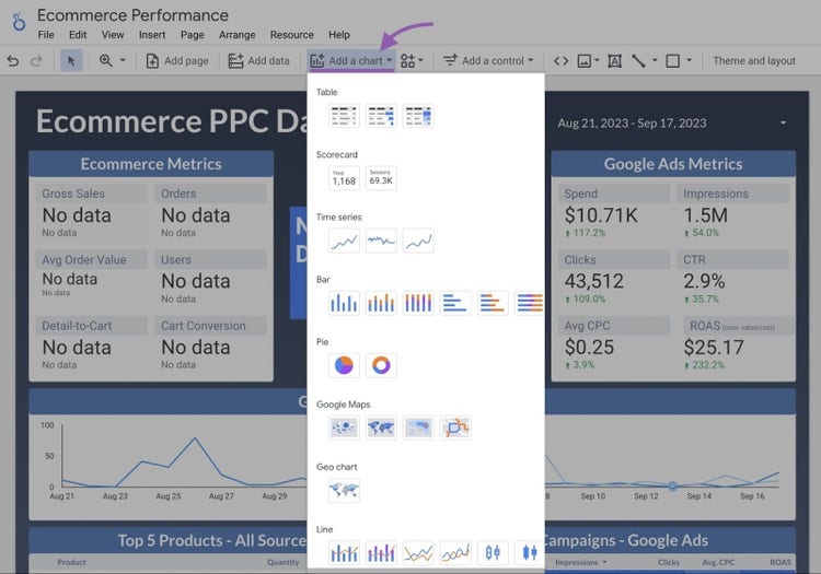
In the below example, we’ve selected a line chart, which is populated with “Date” and “New Users” data:
Alternatively, click and drag any dimension or metric from the data panel. Looker Studio will choose the chart it thinks will work best for the job.
In the below example, we’ve chosen “Age” as the dimension. The metric is “New users.” Looker Studio has decided to display this data as a table:
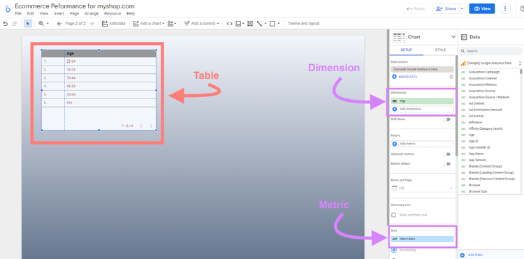
Placing your chart opens up the properties column with options to customize your chart.
If you want to change the type of chart, click on the arrow next to “Chart.”
For example, a bar chart makes better visual use of our data than a table. We can select this from the list and Looker Studio puts the same data into the new format:
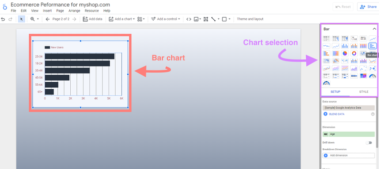
In the “Setup” tab, check that your chart includes the right information. If you’ve used the “Add a chart” option, you might need to select different dimensions and metrics.
If you want to add another dimension or metric, click on the + icon below each option.
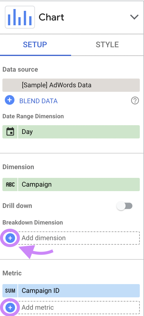
Under data source, you’ll also see an option to blend data.
Blending data lets you add multiple data sources to your charts. For example, you can combine Google Ads data with Google Analytics data to get a unified view of a marketing campaign.
Any metrics you add are included in your chart. In the below example, we’ve added “Sessions” to our bar chart. This data now shows alongside new user data:
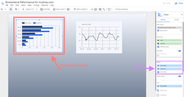
Under Metric you can also choose to:
- Turn on Optional metrics to change which columns you want to see in a chart without having to edit the chart configuration every time
- Turn on Metric sliders to limit the chart by value (e.g., only show orders between $50 and $100)
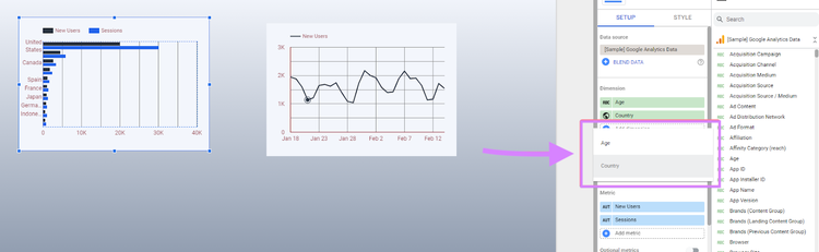
If you want to show more than one dimension in your chart, you can choose the Default drill down level.
For example, if we add country as a dimension to our Age bar chart, we can choose Age or Country as the default drill down option. We can then switch between the two datasets in the same chart:
Charts are styled according to your theme, so colors and fonts should match other elements.
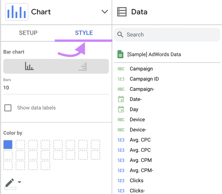
If you want to make changes, click the “Style” tab to tweak color, text, axis, and background.
Controls in Looker Studio
Controls are filters that let users change the view as they analyze data. They help keep dashboards concise and give viewers autonomy over how they consume the information.
Say you want to show how a campaign performs on mobile vs. desktop. Rather than creating a separate chart or page, you can add a control that lets users switch between mobile and desktop performance.
There are two levels of controls you can add to your reports:
1. Report-Level Controls
Report-level controls change every chart on your dashboard at once. Looker Studio lets you do this by:
- Date range control
- Data control
Date range control lets you or your audience set a date range for all the data on a report.
For example, you might set the date range for the past 30 days, but a client wants to see data from the past three months.
Data control lets you display the same charts for different uses. That’s useful if you control multiple dashboards.
For example, an agency marketer who manages analytics for several clients can add a data control to switch between dashboards rather than building multiple reports.
2. Chart-Level Controls
With chart-level controls, you can change a single dimension or metric within charts rather than the dashboard as a whole.
If you use the same metric or dimension in different charts, a control will change the information for every chart.
For example, if you have two charts that show pageviews and new users, a control added to one chart will change the data on both when used.
There are six chart-level controls you can add to reports:
- Drop-down list: Use a drop-down to let users view specific data within a chart (e.g., change the page to view metrics such as session length or bounce rate for the specific page)
- Fixed-size list: Identical to a drop-down list, except it already appears open so the user doesn’t have to open the list
- Input box: Use input boxes to let users type the value they want to view rather than have them select it from a list
- Advanced filter: Use this option to let users build a custom filter. Filter options include “Equals,” “Contains,” and “Starts with.” These give users more control over their search.
- Slider: Use the slider to let users establish a range or limit for the metric in your chart (e.g., date or number of pages)
- Checkbox: This option is reserved for boolean values (true/false statements). Use a checkbox if you want to let the audience select all true or false values (e.g., exclude a specific domain).
How to Add a Control in Looker Studio
Click “Add a control” in the toolbar and select the control type from the list. Drag and drop your control where you want to place it.
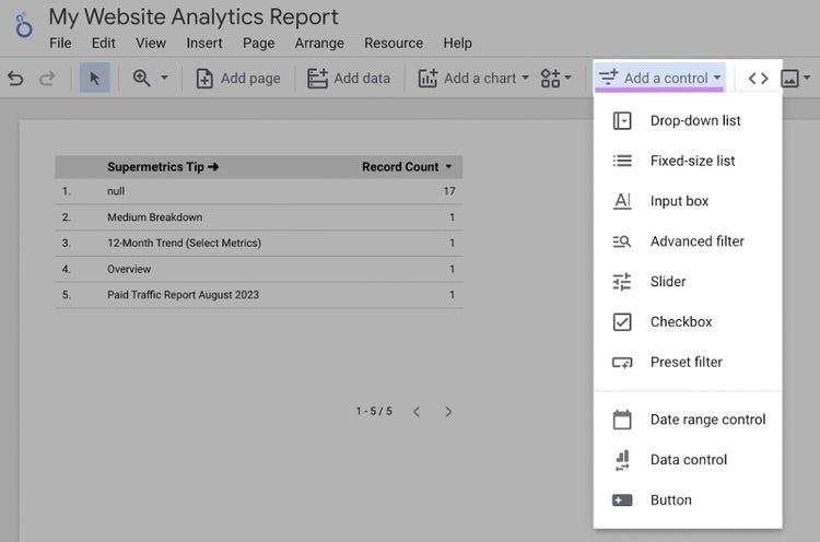
Once placed, you can customize the control in the properties panel.
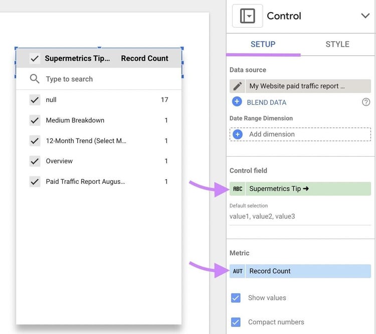
Use the “Setup” tab to set your dimension and metric. Use the “Style” tab to edit the look of your control in keeping with the rest of your dashboard.
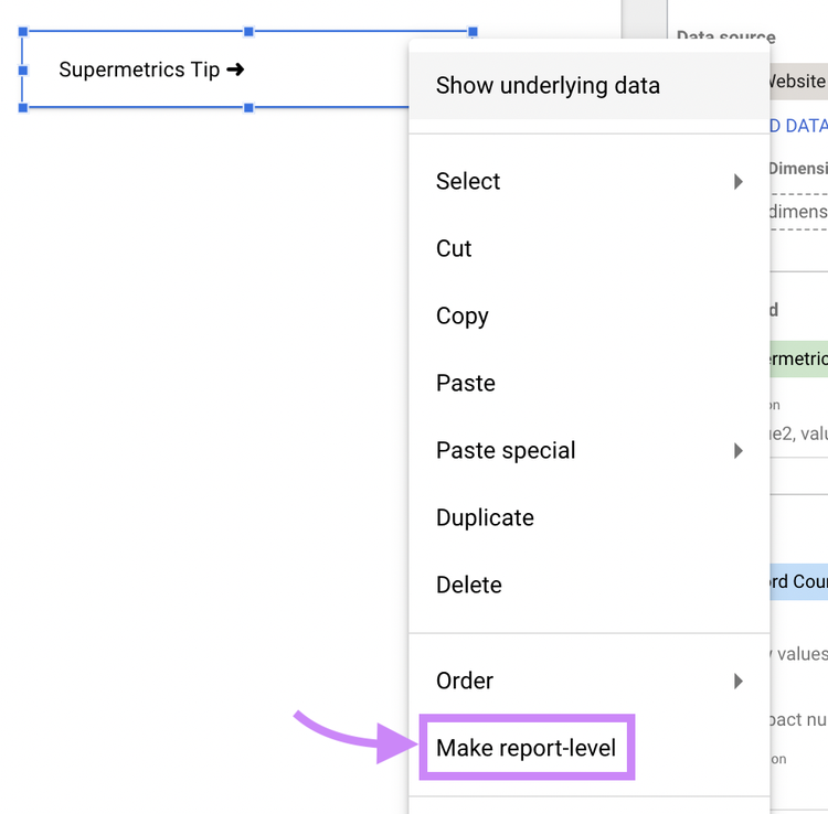
If your report has several pages, you can make the control appear on every page. To do this, right-click on the control and select “Make report-level.”
How to Share Your Looker Studio Reports
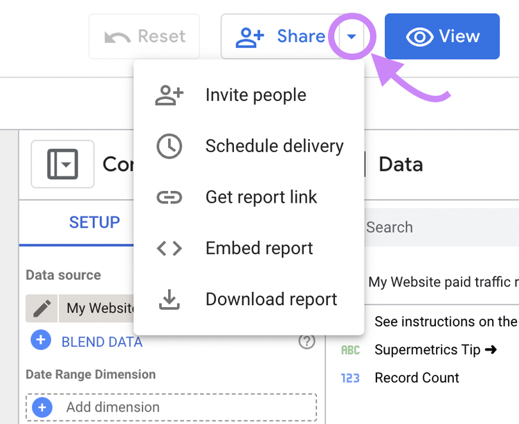
When you’ve created a report you’re happy with, you can share it from the Looker Studio editor by clicking “Share.”
There are several ways to share a report:
- Invite people: Share the report in real time with members of your team (they must have a Google account)
- Schedule email delivery: Send the report to a stakeholder or client’s email address at a specific time and date
- Get the report link: Get a report link to copy and paste to share via email or message
- Embed report: Get an embed code to add your live report to a webpage
- Download report: Save the report as a PDF. It can be password protected and downloaded with or without a link and background color
If you’re inviting people to view a live report, check the share settings. They let you choose what the recipient can and can’t do when they open the report.
Each person you add can be set as a “Viewer” or “Editor.”
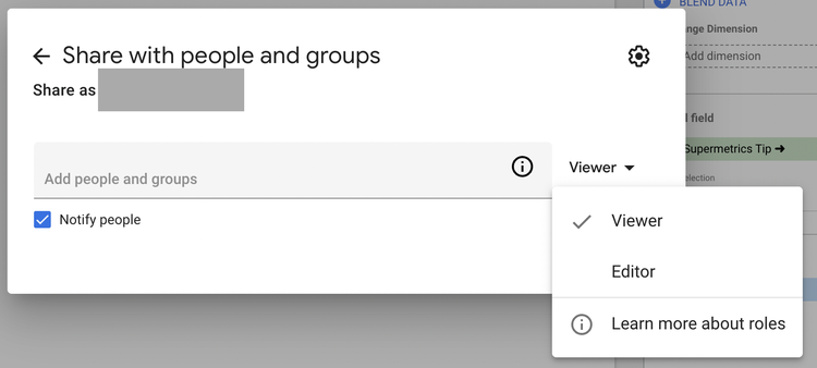
Viewers can look at interactive reports and use controls, but access to editing tools is removed.
Editors can use the toolbar and navigate the report in the same way you do. But you can set usage parameters to limit their access.
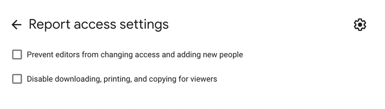
In the share settings, click on the gear icon in the right corner of the pop-up to:
- Prevent editors from changing access and adding new people
- Disable downloading, printing, and copying for new viewers
Finally, as an added security feature, Looker Studio lets you choose how to share links to the report:
- Restricted: Only people you have shared the report with can open the link
- Unlisted: Anyone with the link can view or edit the report (depending on the permissions)
- Public: Anyone can find and view or edit the report
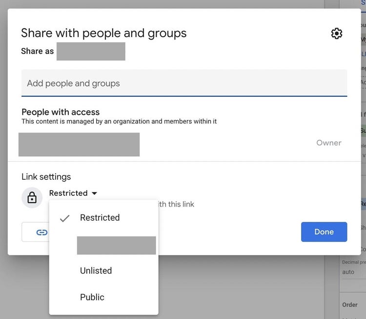
If you’re sharing a report with the public, think carefully about user permissions. Making your report available to edit gives anyone with the link access to your data, potentially compromising its integrity.
Use Looker Studio to Bring Your Data to Life
A performance dashboard is a powerful tool for any marketer. Combining the right data with the right charts will help you spot weaknesses and opportunities to make better business decisions.
Use this guide to get started with Looker Studio and swap tedious spreadsheets for clear, comprehensive reports. Save even more time with our Looker Studio SEO Template.

The Semrush Team brings together AI visibility experts, SEO specialists, data analysts, and product practitioners to help businesses grow and manage their online visibility. We publish research, experiments, and practical guidance grounded in real data from the Semrush platform, covering search, content marketing, and the broader digital marketing landscape.

Tells Google to show you more from Semrush in AI, Search, and Discover.